

Hello fellow Burners,
While we usually talk about how to build physically a Theme Camp, today I am curious to hear the story behind the visual identity of your camp. The logo, the font, the stickers...
We are trying to bring a new camp this year, and I feel that this visual identity is an important step for people to identify to the project.
I have tried things, but I am pretty bad at this, everything looks childish.
I consider using Fiverr to get some ideas or things done.
What's your story?
How would you approach this?
Camp visual identity
Re: Camp visual identity
So are you the kind of camp that gives out stickers with your camp name prominently displayed? (I prefer the ones that just have graphics with burning Man and the date.)
The logo, the font?
The logo, the font?
Won't they know your orgy bar when they see it? Just do a great project and forget the 'branding'.I feel that this visual identity is an important step for people to identify to the project.
Those aren't buttermilk biscuits I'm lying on Savannah
Pictures or it didn't happen Greycoyote
Talent hits a target no one else can hit; Genius hits a target no one else can see.
Arthur Schopenhauer
Pictures or it didn't happen Greycoyote
Talent hits a target no one else can hit; Genius hits a target no one else can see.
Arthur Schopenhauer
-
BBadger

- Posts: 6074
- Joined: Wed Jan 19, 2011 10:37 am
- Burning Since: 2010
- Location: (near) Portland, OR, USA
Re: Camp visual identity
I think you should start Bad Typography Camp and print out your camp name in Comic Sans with really bad kerning in black on white office paper taped together.
"The essence of tyranny is not iron law. It is capricious law." -- Christopher Hitchens
Hate reading my replies? Click here to add me to your plonk (foe) list.
Hate reading my replies? Click here to add me to your plonk (foe) list.
-
BBadger
- Posts: 6074
- Joined: Wed Jan 19, 2011 10:37 am
- Burning Since: 2010
- Location: (near) Portland, OR, USA
Re: Camp visual identity
On a different note, I'm with Ratty: I don't really like stickers or pins or whatnot that have a camp name all that prominent. Usually what most people do is build their logo and media around their theme or whatever funny thing they're doing. Unless your camp is super memorable and important, I'm not sure what plastering your name all over your stuff like some no-name DJ is really doing for you. On teh other hand, if you're memorable and important you don't need to do it either.
For your camp sign, why don't you design your logo and such that you can build something around it or decorate it. If it's readable and looks nice and creative, it doesn't have to be cutting edge design.
For your camp sign, why don't you design your logo and such that you can build something around it or decorate it. If it's readable and looks nice and creative, it doesn't have to be cutting edge design.
"The essence of tyranny is not iron law. It is capricious law." -- Christopher Hitchens
Hate reading my replies? Click here to add me to your plonk (foe) list.
Hate reading my replies? Click here to add me to your plonk (foe) list.

Re: Camp visual identity
BBadger wrote:I think you should start Bad Typography Camp and print out your camp name in Comic Sans with really bad kerning in black on white office paper taped together.
Exactly . . . people care more about a meaningful experience/fun time/interesting décor than the name or url or stickers.BBadger wrote:On a different note, I'm with Ratty: I don't really like stickers or pins or whatnot that have a camp name all that prominent. Usually what most people do is build their logo and media around their theme or whatever funny thing they're doing. Unless your camp is super memorable and important, I'm not sure what plastering your name all over your stuff like some no-name DJ is really doing for you. On teh other hand, if you're memorable and important you don't need to do it either.
picsoung, If you're on a budget, think about signage first. Your camp name, and maybe something announcing events ("Gin & tonics! Monday, Wednesday, Friday at Sunset". Bright colors, good contrast, big headline. Stake it to the playa. This way if you list an event in the Who/What/Where, people can find your camp and know that they're welcome.
Flags and tapestries are also nice; one of my favorite camps bought a bunch of pretty tapestries in a specific range of colors and zip tied them to the top of the shade structure.
If you're trying for a somewhat uniform look in camp you can attempt a color palette, but that can be hard unless you're starting with nothing and ready to buy everything. In 2009 my friend and I had a Duck motif and repeated it as often as possible.
*** The Burning Man Survival Guide ***
"I must've lost it when I was twerking at the trash fence." -- BBadger
"Snark away, ePlaya, you magnificent bastards." -- McStrangle
"I must've lost it when I was twerking at the trash fence." -- BBadger
"Snark away, ePlaya, you magnificent bastards." -- McStrangle
-
AntiM
- Moderator
- Posts: 20302
- Joined: Wed Mar 24, 2004 5:23 am
- Burning Since: 2001
- Camp Name: Anti M's Home for Wayward Art
- Location: Wild, Wild West
Re: Camp visual identity
I have an old piece of wood and a road easel, and just slapped paint on it. It was meant to look janky. A few years we did random Godzilla t-shirts, and we've yet to do stickers. But we might. If the budget ever allows. Or if I remember in time.
I too prefer Generic Burning Man stickers, unless the artwork is something special. Perhaps you're overthinking this?
I too prefer Generic Burning Man stickers, unless the artwork is something special. Perhaps you're overthinking this?

Re: Camp visual identity
I think your whole design style should be based on emoji koans and hieroglyphic stick-men rebus.
All in primary colors!
So, what was the original question again?
All in primary colors!
So, what was the original question again?
-
Lonesomebri
- Posts: 2890
- Joined: Wed Jun 13, 2012 5:54 pm
- Burning Since: 2024
- Camp Name: CAMP THREAT
- Location: NorCal
Re: Camp visual identity
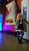
Here at Camp THREAT INC we keep it simple with our swag branding. This years theme: I THREAT.
As for marketing our camp appearance and presentation, sometimes improvisation is the best method.
You do not have the required permissions to view the files attached to this post.
Camp THREAT founder. BRCCP core disgruntled member. Burner. Setting fires since 1974. https://www.facebook.com/profile.php?id ... tid=ZbWKwL
"If this is the best of all possible worlds, what are the others?"
- Voltaire
"If this is the best of all possible worlds, what are the others?"
- Voltaire